Themes
Basalt colours its whole interface through a theme, a named set of semantic colour roles. You can switch between built-in themes live, set a default in your configuration file, or drop your own theme file next to the bundled ones.
Setting a theme#
Choose a theme with the top-level theme key:
theme = "gruvbox-dark"
By default Basalt uses "default", which inherits your terminal's own colours (it sets no background of its own).
The theme picker#
Press <leader>t (Space then t) to open the theme picker. Scrolling previews each theme live across the whole UI, so you can see it before committing:
↩ Enterkeeps the highlighted theme and writes it to your config as the new default.Escreverts to the theme you had when you opened the picker.
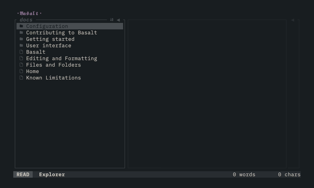
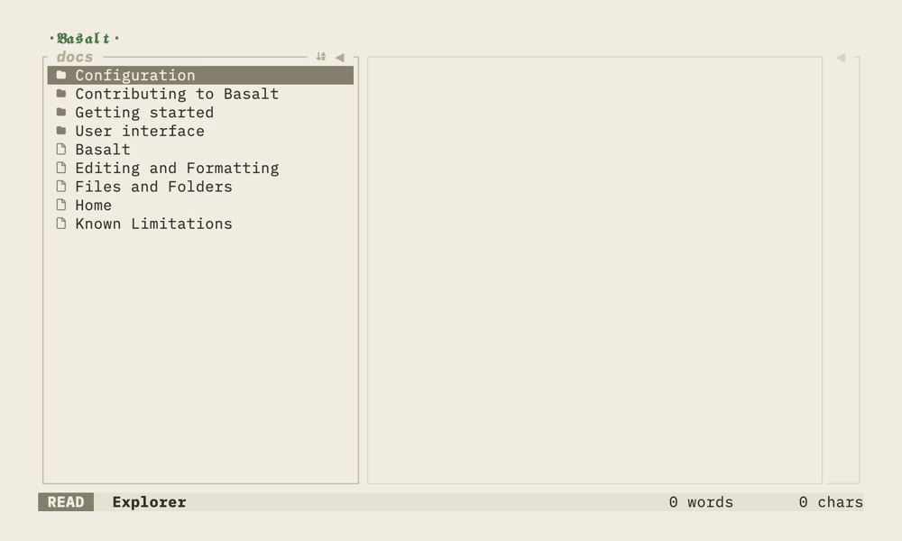
Saving only sets the theme key; the rest of your config (comments, ordering, other keys) is left untouched.
Built-in themes#
| Theme | |
|---|---|
default | Terminal-default palette (no background of its own) |
causeway-dark, causeway-light | Basalt's own theme - weathered volcanic stone by the sea |
gruvbox-dark, gruvbox-light | Gruvbox |
everforest-dark, everforest-light | Everforest |
nord | Nord |
dracula | Dracula |
catppuccin-latte, catppuccin-frappe, catppuccin-macchiato, catppuccin-mocha | Catppuccin |
minimal | A quiet dark theme that keeps only the dividers between panes |
Creating your own theme#
Drop a <name>.toml file into your themes directory and it appears in the picker under <name>:
- macOS and Linux:
$XDG_CONFIG_HOME/basalt/themes/(usually~/.config/basalt/themes/) - Windows:
%APPDATA%\basalt\themes\
A user theme that shares a built-in's name overrides it. The bundled themes (e.g. gruvbox-dark.toml) are good starting points. Copy one and adjust.
Format#
A theme is a [palette] of named colours plus a colour for each role. A role's value is either:
- a palette key (e.g.
accent = "mauve"), or - a literal colour, a hex string
"#rrggbb"or an ANSI name ("red","darkgray","reset", …).
Any role you leave out keeps the default theme's value, so a theme only needs to set what it changes.
# themes/my-theme.toml
text = "fg"
background = "bg"
accent = "iris"

heading-2 = "gold"
code-bg = "surface"

[status-bar]
background = "surface"
foreground = "fg"

[palette]
fg = "#e0def4"
bg = "#191724"
surface = "#1f1d2e"
iris = "#c4a7e7"
gold = "#f6c177"
Colour roles#
| Role | Used for |
|---|---|
text | Primary foreground / body text |
background | Base background painted across the whole UI |
muted | Secondary text: markers, indentation, bullets, badges |
accent | Brand mark and other highlights |
heading-1 … heading-6 | Heading levels |
code-bg | Background of fenced code blocks (a raised surface reads best) |
blockquote | Block-quote bar and text |
list-marker | List bullets and ordered-list numbers |
task | Task check-box marker |
mode-insert | Status-bar mode block: insert / edit |
mode-normal | Status-bar mode block: vim normal |
mode-read | Status-bar mode block: read-only |
success, info, warning, error | Toasts and callouts |
Mode-block text picks whichever of background / text is more legible over the mode colour, so any mode colour stays readable.
Syntax highlighting#
The [syntax] table colours the tokens of a fenced code block that names a language. Plain code, such as variable names and operators, keeps the text colour. Any role you leave out keeps the default theme's value.
[syntax] role | Used for |
|---|---|
keyword | Keywords, storage modifiers and HTML tags |
string | String literals |
comment | Comments |
function | Function and method names |
type | Type, class, struct and trait names |
constant | Numbers, booleans, null and escape sequences |
[syntax]
keyword = "iris"
string = "pine"
comment = "muted"
function = "foam"
type = "gold"
constant = "rose"
Borders#
border, border-active and border-type set the default border for every pane. border-type is one of:
border-type | |
|---|---|
none | No border |
plain | Straight single line |
rounded | Rounded corners |
thick | Heavy single line |
double | Double line |
Left unset, border-type follows the active Symbols preset (thick when focused, rounded otherwise).
Per-pane sections#
Each pane can override the globals in its own table: [explorer], [note-editor] and [outline] accept background, border, border-active, border-type and border-edges; [status-bar] has no border and takes only background and foreground.
border-edges chooses which sides draw, so a theme can keep only the dividers between panes instead of full boxes:
border-edges | Sides drawn |
|---|---|
all | Every side (default) |
none | None |
top, bottom, left, right | That single side |
vertical | Left and right |
horizontal | Top and bottom |
# Only the dividers between panes, no outer frame (see the bundled "minimal").
[explorer]
border-edges = "right"

[note-editor]
border-edges = "vertical"

[outline]
border-edges = "left"
An unset pane background inherits the theme background, so a single background tints the whole UI consistently.